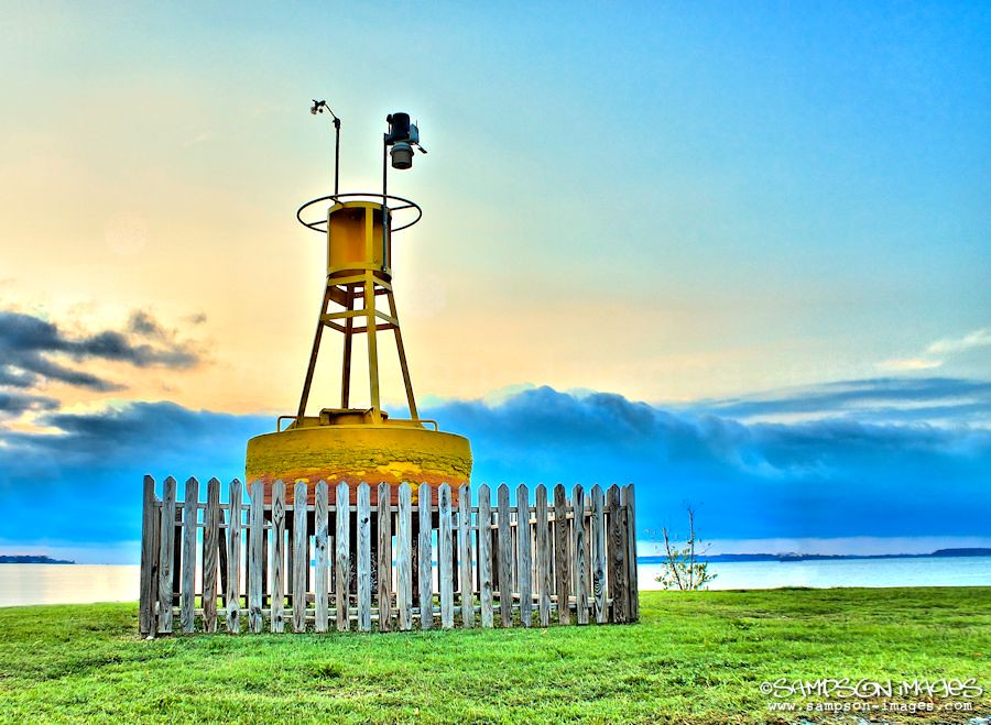
9/15 Solomons Island at sun rise

FMarquart

New Member
I can see the look you are going for, of course it is preference. To my taste it is just a bit on the cold side. The fence especially. The one bird in the upper left side and the water marker on the lower left side I would remove, a little distracting. The overall idea is good but too much saturation IMO.

Frank
 

corollinout

Member
Thank you!

Frank I took some of your critique into consideration, and made some of those. I won't take the logo off thought :)

Thanks for the feedback.
 

FMarquart

New Member
Thank you!

Frank I took some of your critique into consideration, and made some of those. I won't take the logo off thought :)

Thanks for the feedback.

I like it with a warmer touch, what do you think about the difference?? Nothing said about the logo?? Keep it of course and never leave home without it:)

Frank
 
Top