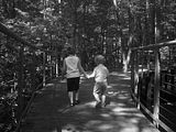
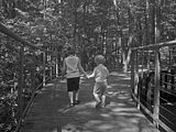
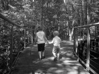
You are using an out of date browser. It may not display this or other websites correctly.
You should upgrade or use an alternative browser.
You should upgrade or use an alternative browser.
Before and after pics
- Thread starter SoccerMom2
- Start date
SoccerMom2
New Member
I just picked up elements 8 as well and I am having to learn a bunch... Picassa I think is the easiest thing around and its free but cant do things I want to do...
Im thinking I need to take a class for this stuff
The rec center has a class for it on weds for $90.
SoccerMom2
New Member
Lots more detail.
Try a color pic. with the individual levels for red, green, and blue.
That will really make it pop.
I just can't believe i made that picture look so much better.
jbr13
www.jbr.smugmug.com
I just can't believe i made that picture look so much better.
If you add a little bit of contrast to your after picture it will make the pic pop a little more. With blask and whites, if you just bring the brightness up thing get a little flat looking.
just my 2 cent
J
bcp
In My Opinion
Going on JBRs suggestion of pulling the contrast,
I took your first photo (hope you dont mind) and I used the color curves in Gimp to enhance the whites and make the darks a little darker.
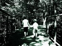
gimp works really well with color.
Next time you get a shot like this, try putting a red filter in front of the lens for the shot with black and white.
For a really cool shot, have the kids standing together with a sunny, yet cloudy sky behind them, then do the black and white with the red filter.
I took your first photo (hope you dont mind) and I used the color curves in Gimp to enhance the whites and make the darks a little darker.

gimp works really well with color.
Next time you get a shot like this, try putting a red filter in front of the lens for the shot with black and white.
For a really cool shot, have the kids standing together with a sunny, yet cloudy sky behind them, then do the black and white with the red filter.
hvp05
Methodically disorganized
I'm curious how she altered it. To me, it doesn't look like a "brightness" alteration because the highlights are no brighter than before; actually, they're less so. So I think it's either a flattening of the contrast (via the basic contrast function) or she may have flattened the curve.If you add a little bit of contrast to your after picture it will make the pic pop a little more. With blask and whites, if you just bring the brightness up thing get a little flat looking.
The basic brightness/contrast function and curves do the same thing, essentially, but it's like trying to slice a loaf of bread with either a dull pocket knife or a fine chef's blade.
Contrast is critical in most every photo. Unfortunately, many people want to see "detail" in every part of the photo and end up pulling back the contrast, which can weaken the impact.
SoccerMom2
New Member
I used the shadow/highlights tool. I adjusted it a little. I do think the trees in the back did come out too light and dull looking. It needs more of the black back in it. Im still learning and figuring things out. I will try the other methods and see what comes out. Thank you for all of your suggestions. It is really nice to get some suggestions. A book can only take you so far.
SoccerMom2
New Member
Going on JBRs suggestion of pulling the contrast,
I took your first photo (hope you dont mind) and I used the color curves in Gimp to enhance the whites and make the darks a little darker.
View attachment 71042
gimp works really well with color.
Next time you get a shot like this, try putting a red filter in front of the lens for the shot with black and white.
For a really cool shot, have the kids standing together with a sunny, yet cloudy sky behind them, then do the black and white with the red filter.
Nope i don't.

SoccerMom2
New Member
Where was the pic taken
Nice bridge??
Ann Marie Gardens.
dn0121
New Member
I just picked up elements 8 as well and I am having to learn a bunch... Picassa I think is the easiest thing around and its free but cant do things I want to do...
Im thinking I need to take a class for this stuff
Try out GIMP too. Its open source (free) and there are lots plugins for it.
sanchezf
Little ol' Me
Sounds familar, where is it?Ann Marie Gardens.
jbr13
www.jbr.smugmug.com
Sounds familar, where is it?
In Lusby, on Dowell Road.
sanchezf
Little ol' Me
Thank youIn Lusby, on Dowell Road.

