You are using an out of date browser. It may not display this or other websites correctly.
You should upgrade or use an alternative browser.
You should upgrade or use an alternative browser.
CC please
- Thread starter jaclyn
- Start date
kom526
They call me ... Sarcasmo
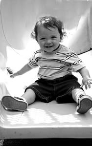
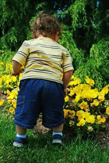
Overall, these are good shots. You caught the little guy staring right at you with a great smile and the curiosity shot is great too. For some reason my wife really likes shots taken from this vantage point, but I digress. With the B&W shot, adjust the RGB along with the contrast. This will sharpen the details more than the "auto sharpen" function. The color one could probably do with a tweak on the contrast as well. Which editing software are you using?
jenbengen
Watch it
Overall, these are good shots. You caught the little guy staring right at you with a great smile and the curiosity shot is great too. For some reason my wife really likes shots taken from this vantage point, but I digress. With the B&W shot, adjust the RGB along with the contrast. This will sharpen the details more than the "auto sharpen" function. The color one could probably do with a tweak on the contrast as well. Which editing software are you using?
I agree with the b&w one. Adujust the contrast and shed more light on his face. Right now, there is too much brightness coming from the white around him. Cute pics!
jaclyn
Not a Lurker anymore!
Well...I tried...UGH!
I am having no luck at adjusting the RBG/Contrast in the B/W photo. It either turns out too bright, or too dark. Ive always used the " convert to black and white" option, but now that I have seen those type of B/W shots, that really POP...Im jealous! EErrr!
I am having no luck at adjusting the RBG/Contrast in the B/W photo. It either turns out too bright, or too dark. Ive always used the " convert to black and white" option, but now that I have seen those type of B/W shots, that really POP...Im jealous! EErrr!
kom526
They call me ... Sarcasmo
I am having no luck at adjusting the RBG/Contrast in the B/W photo. It either turns out too bright, or too dark. Ive always used the " convert to black and white" option, but now that I have seen those type of B/W shots, that really POP...Im jealous! EErrr!
There is an online video tutorial @ adobe that will walk you through the process. I found it by googling. I too am stumbling through Elements 6 right now the project is to print multiple photos on one sheet. I can't seem to get my files selected in Br over to PsE.

Sarah Lynn
Giddy up
IMO all they need is a fill flash. It makes a great difference sometimes.
Baja28
Obama destroyed America
Constructive Criticism please. How can I make these better?


Don't dress the lil guy in clam diggers.

Geek
New Member
KurtPreston
New Member

In addition to what's already been said, if this was a crop, back off a little bit and give him some more room on the sides. I really like the vertical orientation, that works well with the slide. Maybe pan upwards just a bit to get rid of the dark shadow under the slide.

Composition looks real good, the back of the pants are just a smidgen too dark. Pose wise, did you have a shot a few moments later where he was reaching more for one of the flowers?

