CableChick
Loved


Last edited:

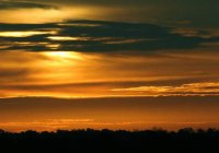
I will critique #1 ~ Good job of exposure, the color is perfect. The tree line was crooked by 1 degree , Try to not center your subject , here is a quick edit . Keep up the good work .
Cheers DeadEye.

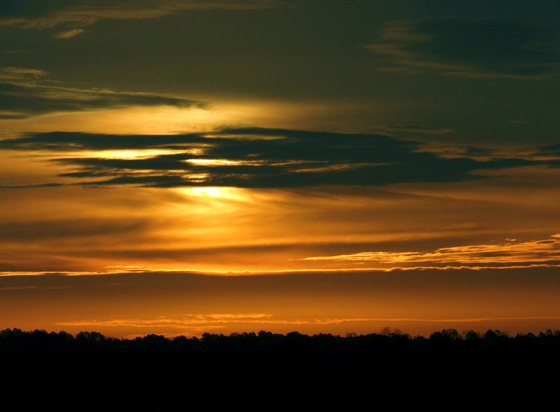
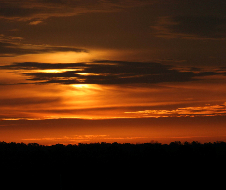
I can only see the middle two images, strangely enough. The first one (well second image) i would have included less foreground and more sky, which would eliminate half the frame being dark, and would place the horizon in the bottom third of the frame. Also, i would have darkened the the roof of the barn so that it was more of a silhouette like the rest. The second shot of the barn is better in terms of exposure and composition, as the horizon is not in the center, although it look slightly crooked (needs to be rotated clockwise to straighten).
I can see the image DE posted, that was the first image, looks very nice
I'll play w/ those two tonight and see what I come up with!