Charts are misleading... & my math skills need improvement.
Actually, under Obama, the DJI grew 148%. An average of 18% per year. So far, under Trump, the DJI has grown 6.5%. So, if that trend continues, we're looking at 15-18% of growth during Trump's first year. So, it's looking like the trend during the last administration is continuing.
View attachment 118799
View attachment 118800
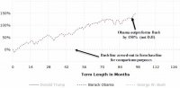
With all due respect: I think your charts are very misleading (not necessarily intentionally) The first chart appears to show 150% improvement over what? What's the zero baseline?
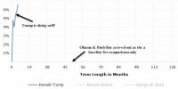
The DJI? No. I think not. It shows 150% improvement over 'Bush's line' which has been normalized or 'zeroed-out' to serve as a 0 baseline Thus it shows Obama outperformed Bush by 150%. That may be accurate. Your 2nd chart tries to normalize the Bush/Obama trace as a baseline and project Trumps gain in comparison.
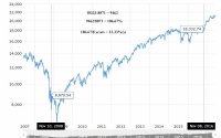
I've included an actual DJI for 10 years. Note the difference between Obama was elected and Trump was elected. The gain is 106.67% over 8 years or 13.32% per year. Trump's >18% was achieved by March 1, 2017 so projecting as 5% for a year yet undone is frau... incorrect. That said, I did make a math error calculating 5% per year under Obama. Sorry.
I would be interested to see where the DJI gained 150% from the beginning of Obama's term to the very end. If you can, I'll admit my error.