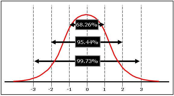
When I think average, above average & below average, I put average at around 50%. Then use a bell curve with a 33%, 66% splits for the various categories.
Think in terms of this:

The bulk of the men would fall around just short of average to slightly above average. The other 33% are divided between the much better looking and the extremely unsightly guys. Just 2.5% would be considered mega attractive or what ever word they are using to describe the best looking males.
It's easy to skew results. What if North American women were only shown pictures of Syrian refugee males? Might that affect how attractive they viewed those men?
It's been a while since I took classes on this but if I recall correctly in this example the findings would be invalid. What would happen is the the qualifier for attractive would need to shift to include more until distribution more closely resembles the chart above.
Think in terms of this:

The bulk of the men would fall around just short of average to slightly above average. The other 33% are divided between the much better looking and the extremely unsightly guys. Just 2.5% would be considered mega attractive or what ever word they are using to describe the best looking males.
It's easy to skew results. What if North American women were only shown pictures of Syrian refugee males? Might that affect how attractive they viewed those men?
It's been a while since I took classes on this but if I recall correctly in this example the findings would be invalid. What would happen is the the qualifier for attractive would need to shift to include more until distribution more closely resembles the chart above.


