Welcome back! Here's what's new:

If I may ...

So now there is no way, at a glance, to ascertain which post we have replied in as before where a little green dot indicated such? BTW, I know my opinion means squat, however, I do not like the new format. What exactly was wrong with the old to move to this?
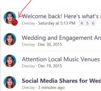
Look at the avatar of the user who created the thread. If you replied, your avatar will be inset.
134795
 

LightRoasted

If I may ...
If I may ...

Bold means unread posts/threads; not bold means you've read everything. It's kind of hosed up because it's new and the hamster doesn't know what you've read and what you haven't. To start fresh, go into each forum main category and mark it read (little box at the top right).

Ain't dat wut I said? It no workie like b4. Maybe get a gerbal involved? Hear they have a higher level of intelligence. At present, too much work involved for end-user to do something that was automatically accomplished by previous software. BTW. Your top left page logo still does not take one to the primary somd.com homepage, like it used to.
 

vraiblonde

Board Mommy
PREMO Member
Patron
BTW. Your top left page logo still does not take one to the primary somd.com homepage, like it used to.

That logo has always taken you to the main forum page - I know this because it used to annoy the hell out of me. But thanks for the reminder - I've been meaning to complain to David about this for years. :jet:
 

LightRoasted

If I may ...
If I may ...
That logo has always taken you to the main forum page - I know this because it used to annoy the hell out of me. But thanks for the reminder - I've been meaning to complain to David about this for years. :jet:

No way. I do believe you are incorrect. I distinctly remember, many, many, many times, by want of going there, clicking the top left corner logo to go to the page website page. Why? Because the forums section is a sub section, or root. of somd.com. Plus, it doesn't make sense to keep a user locked into a website subsection without a way to navigate back to the main, and primary, part of a website. And even the "Home" link would take you to somd.com. Whereas now it's the root, forums.somd.com, non-nonsensical. If you have the ability, pull up an archived version of the old format and check. I betcha I'm correct. But either way, there is no way to navigate to the primary web page of somd.com by clicking a link or button.
 

David

Opinions are my own...
PREMO Member
and if there are any other suggestions for popularly used links to go under the Home menu, be sure to @David me.

I must say that this user tagging is an excellent idea.
 

jazz lady

~*~ Rara Avis ~*~
PREMO Member
@David The old forums showed "Members online" in alphabetic order while the new one shows them in last activity order. I don't know about anyone else, but I liked it better the old way as it is more useful.
 
Jazzy, your decades of programming , testing and quality assurance is showing... look at the brains on Jazz!
 
Top